Northeastern University Sustainability Data
Website Design | Research | Coding

Northeastern University
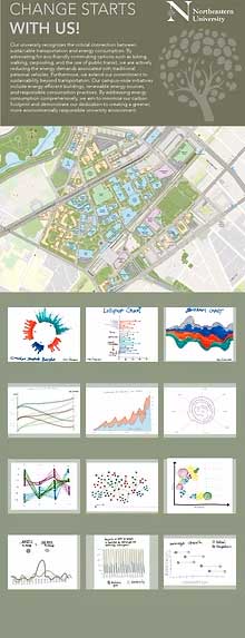
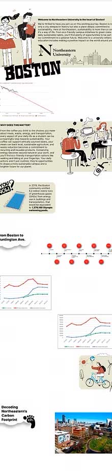
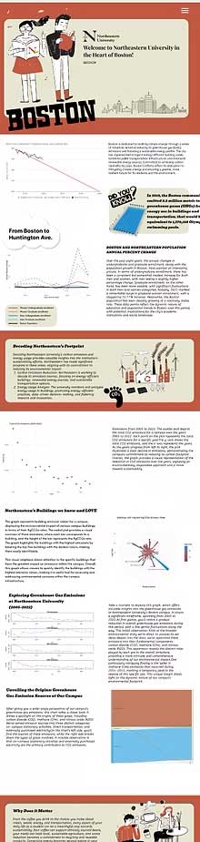
Sustainability Hub The sustainable management of universities is key for ensuring clean air, water, food, and soil in local ecosystems, supporting the growth of all life and biodiversity, promoting health and human wellbeing, and creating thriving and abundant creative communities. For this project, Northeastern’s Sustainability Office has granted us permission to use their recent data to explore and create a meaningful set of visualizations for communicating key sustainability data. The development of the Northeastern University Sustainability Hub website was a collaborative effort aimed at creating an intuitive and informative platform for incoming students to explore sustainability initiatives on campus.
Duration: 2 months
The Challenge
Objective/Goal


EMPATHIZE
Research
Northeastern University’s campus is huge and right in the middle of the city, isn’t it great?
But is this campus with a relatively old architecture and design even SUSTAINABLE??
But is this campus with a relatively old architecture and design even SUSTAINABLE??
Oh my God!! Its so difficult to understand this data. I wish there was a simpler way of understanding this……
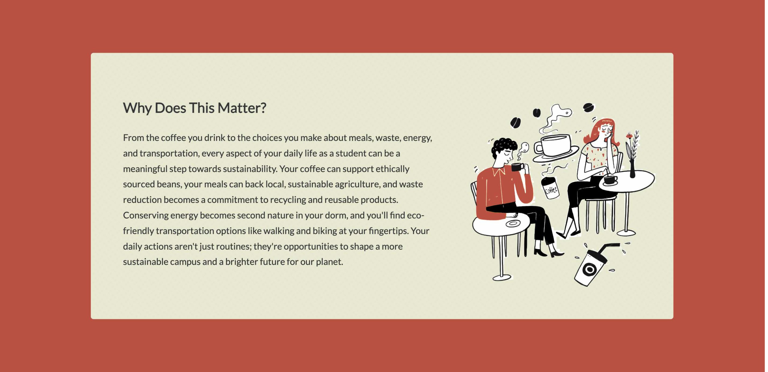
So the aim of this website is collect the data and make it simple and understandable in order to spread awareness among the incoming students……
Research and Data Collection
Buildings with Highest KgCO2e Emission Rate
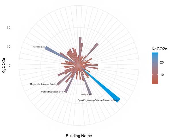
Circular bar graph:
This graph represents building emission values for a campus, displaying the environmental impact of various campus buildings in terms of their KgCO2e rates.The radial plot provides a visual overview of these emissions, where each bar corresponds to a building, and the height of the bar represents the KgCO2e rate.The graph highlights the buildings with the highest emissions by labelling the top five buildings with the darkest colors, making them easily identifiable.
This visual emphasis draws attention to the specific buildings that have the greatest impact on emissions within the campus. Overall, this graph allows viewers to quickly identify the buildings with the highest emission values, making it a useful tool for assessing and addressing environmental concerns within the campus infrastructure.
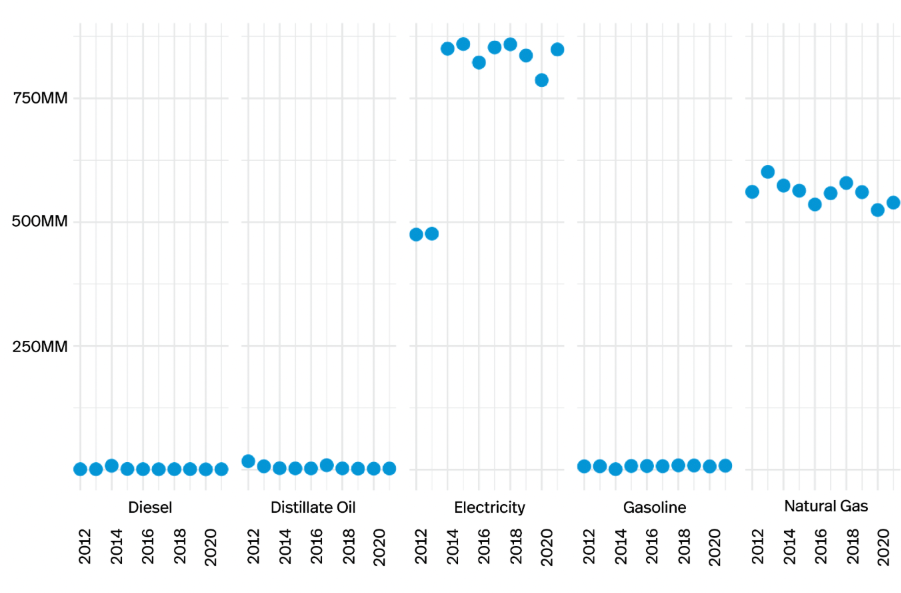
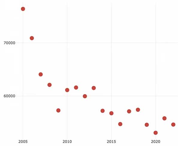
Emissions from 2005 to 2022:
The scatter plot depicts the total CO2 emissions for a campus over the years 2005 to 2022. Each point on the plot represents the total CO2 emissions for a specific year.
The y-axis shows the total CO2 emissions, and the x-axis represents the years. As the years progress from left to right, the plot illustrates a clear decline in emissions, demonstrating the campus’s commitment to reducing its carbon footprint. Overall, the graph provides a visual representation of the reduction in CO2 emissions over the years, signalling an environmentally responsible approach and a move toward sustainability.
Emissions from 2005 to 2022:
Buildings with Highest KgCO2e Emission Rate
Circular bar graph:
This graph represents building emission values for a campus, displaying the environmental impact of various campus buildings in terms of their KgCO2e rates.The radial plot provides a visual overview of these emissions, where each bar corresponds to a building, and the height of the bar represents the KgCO2e rate.The graph highlights the buildings with the highest emissions by labelling the top five buildings with the darkest colors, making them easily identifiable.
This visual emphasis draws attention to the specific buildings that have the greatest impact on emissions within the campus. Overall, this graph allows viewers to quickly identify the buildings with the highest emission values, making it a useful tool for assessing and addressing environmental concerns within the campus infrastructure.
DEFINE
- How might we create a seamless platform where the Northeastern community can effortlessly discover, learn about, and participate in sustainability initiatives across campus?
- How might we streamline access to sustainability resources by offering a centralized hub that connects students, faculty, and staff with programs, events, and research opportunities?
- How might we ensure a personalized and engaging experience that aligns with users’ sustainability interests, academic pursuits, and campus activities?
- How might we empower sustainability initiatives with greater visibility and foster meaningful engagement within the Northeastern community?
DEFINE
- Entry Point:
- User arrives on the landing page
- Welcome Section
- Sees introduction to sustainability at Northeastern
- Call-to-action: “Learn More” / “Explore”
- Navigation Choices (User clicks one of the top navigation links)
- Boston Overview → Introduction to sustainability efforts in Bosto
- NU Footprint → Data on Northeaster’s emissions & energy consumption
- Energy Consumption → Greenhouse gas emissions & energy-saving initiatives
- Transportation → Blue Bikes, EV charging, and public transport options
- Interactive Learning Sections
- User clicks “Read More” buttons → Expands content for deeper insights
- User explores info graphics & charts → Engages with data visualizations
- Encouraging Engagement
- “Why This Matters” Section → Educates users on personal impact
- CTA: Join Northeastern Sustainability Initiatives
- Exit Points
- User leaves after browsing
- User clicks an external link to explore further
- User signs up for sustainability programs
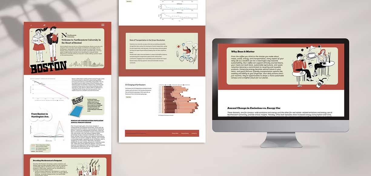
- The design of the Northeastern University Sustainability Hub website was meticulously crafted to embody the university's commitment to sustainability while captivating the attention of incoming students.
- Drawing on a color palette featuring scarlet, light olive, and blue, the design evokes a sense of vibrancy, harmony, and eco-consciousness. Scarlet symbolizes the university's passionate dedication to sustainability initiatives, while light olive represents growth, renewal, and the lush beauty of nature. Complemented by calming shades of blue, reminiscent of clear skies and pristine waters, the color scheme reflects the interconnectedness of environmental stewardship and personal well-being.
- Through the thoughtful integration of these hues, the Sustainability Hub fosters a sense of optimism and excitement, inspiring incoming students to explore and engage with sustainability in a meaningful way.
Buildings with Highest KgCO2e Emission Rate
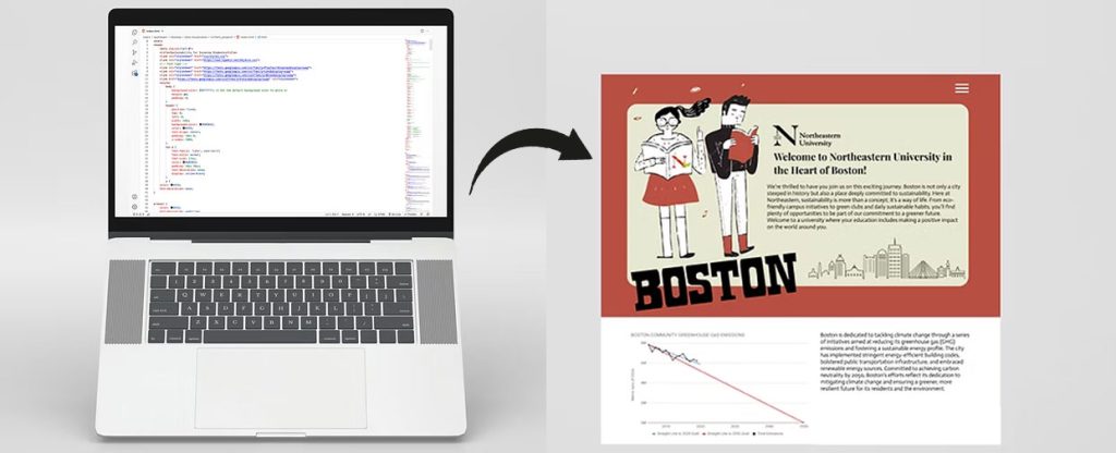
The primary design and development of this project was done using Figma, facilitating collaboration, iteration, and efficiency. It helped in creation of visually compelling and user-centric layouts, incorporating a harmonious blend of typography, imagery, and data visualization elements.
Subsequently, the Figma designs were translated into HTML and CSS code to bring the website to life. This process involved attention to detail, ensuring pixel-perfect implementation of the design while optimizing for performance and responsiveness across different devices.
Some Other Projects
Eventsza
Eventsza is a digital marketplace that connects users with event vendors worldwide, making event planning effortless and accessible.
DZA
DZA Legal, a distinguished law firm, required a digital presence that reflected its expertise, professionalism, and commitment to providing legal services with integrity.
Northeastern University Sustainability Hub
The sustainable management of universities is key for ensuring clean air, water, food, and soil in local ecosystems, supporting the growth of all life and biodiversity
Dynamics of Workshop Facilitation
This is an ongoing research that delves into the multifaceted role of card deck games in facilitation,
Salus Populi (Live)
Salus Populi is a judicial education program at Northeastern University aimed at educating the judiciary
Data Campaign: We Deserve Better
The “We Deserve Better” data campaign draws inspiration from the vibrant and bold works of artist and designer Yinka Ilori, known for his colorful and engaging designs.
Crime Rate in United States
The dataset on crimes in various cities of the United States over the last 35 years has been analyzed and visualized using different layers,
GreeneGene
The dataset on crimes in various cities of the United States over the last 35 years has been analyzed and visualized using different layers,
Charged Journeys: Exploring the Electric Vehicle Revolution
Powered by JavaScript’s p5.js library, this dynamic data visualization unveils insights from a publicly available dataset on electric vehicles in the United States.